A DATA WAREHOUSE APPLICATION REDESIGN

Comporium, a telecommunications provider, was seeking to update their system used for reporting and data analysis. In addition to backend updates, the Client also wanted to modernize the look and feel of their legacy application.

Overview
The Client sought to maintain the existing functionality of the legacy system while updating the UI to give the application an up-to-date aesthetic . Throughout this process I was also able to identify areas of improvement making the application more intuitive and user-friendly. I worked with the Client and the development team to ensure the design intent was implemented.
Tools used
Adobe Xd
Overflow
Designed for

ReactJS
Existing Application Documentation
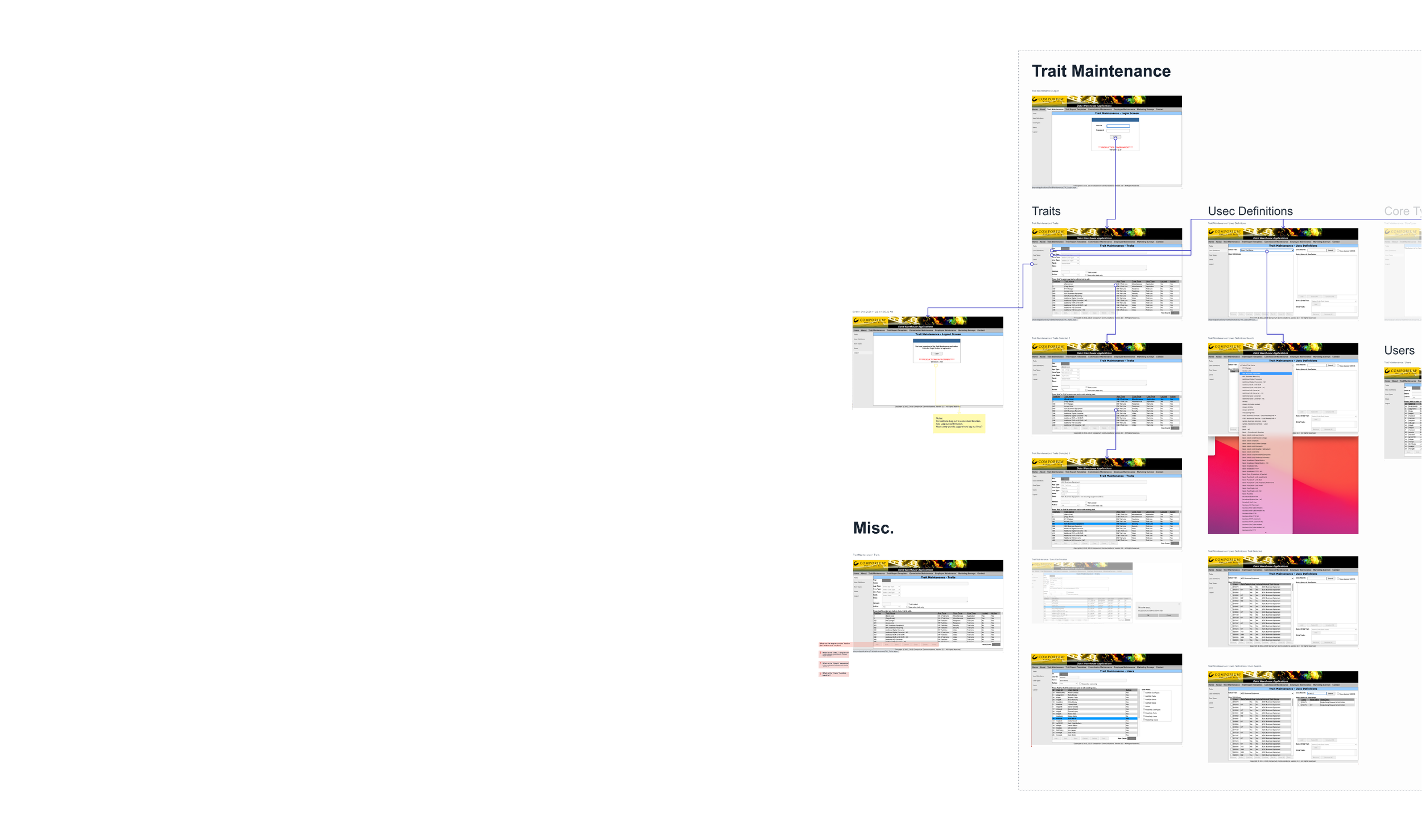
I started by documenting the legacy application to better understand the different types of screens, components used, and interactions between interfaces.
When working on a feature parity project, I find it beneficial to document and understand the application I am reimagining.
I used this overflow document as a communication tool with the Client to answer questions, identify areas of improvement, and omit areas of the application that were no longer needed.
Streamline communication with Clients
Quickly identify consistencies between screens to make well informed component/layout decisions
Using the overflow as a baseline for wireframes
Estimate and determine the number of mockups needed
Documentation Benefits
Top Navigation Improvements
To better utilize the space available, I updated the top navigation by removing unnecessary imagery and the sections of the application that were no longer needed. Beyond just updating the clients’ logo, making changes to the tabs and side navigation allows the user to better visualize which area of the application they are viewing.

Legacy top and side navigation.
Updated top and side navigation.
Designing for Existing Users
Being mindful of the existing users when updating these interfaces was important to the success of this project. I was intentional in maintaining the location and order of the functions within each screen. By not completely disrupting the location of buttons and tables the new application has a familiarity for existing users reducing time spent onboarding.

Example of legacy application layout.
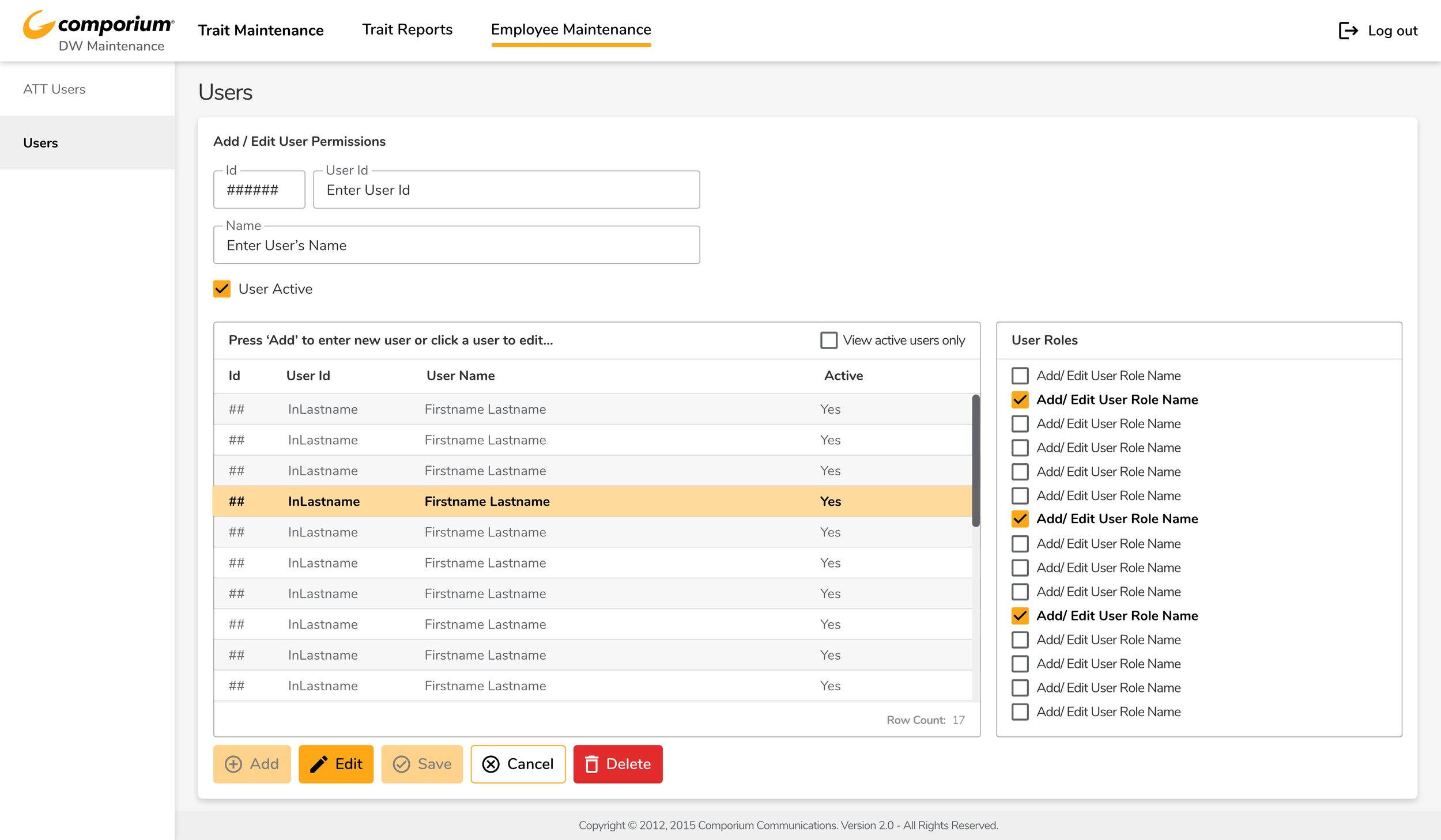
Updated interface layout.
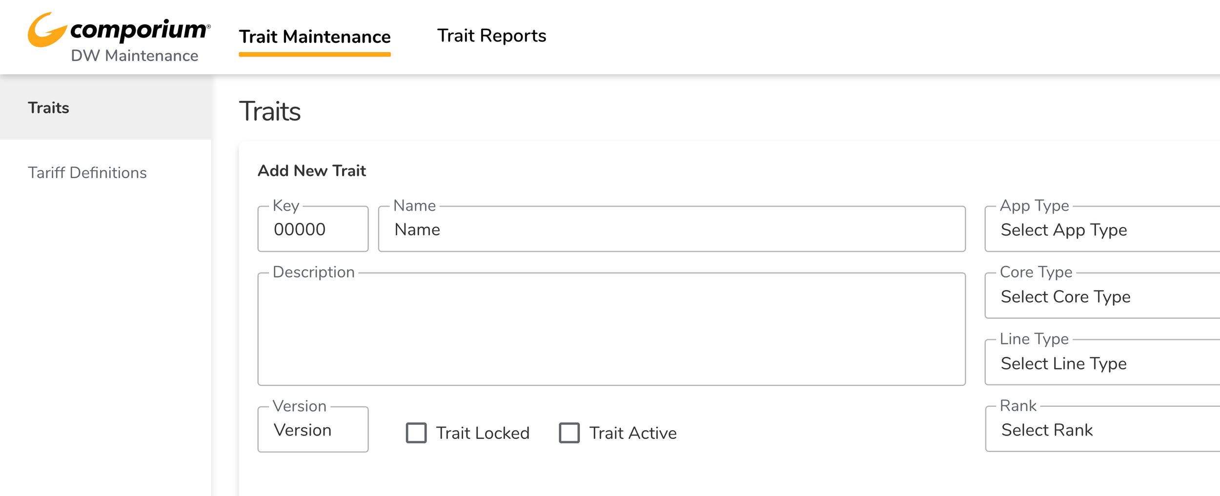
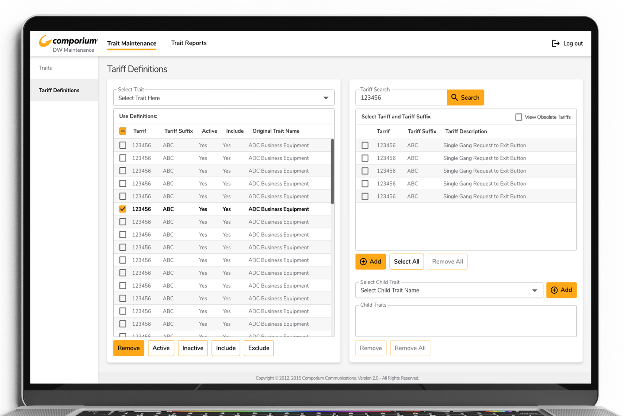
Intuitive Improvements
While the scope of this project was to mirror the existing application, I found ways to identify areas of improvement. The Design Template screens below illustrate one such improvement. Changing the dated true/false values approach to instead display those functions as a toggle button provides a more intuitive experience for the modern user.

Legacy application.
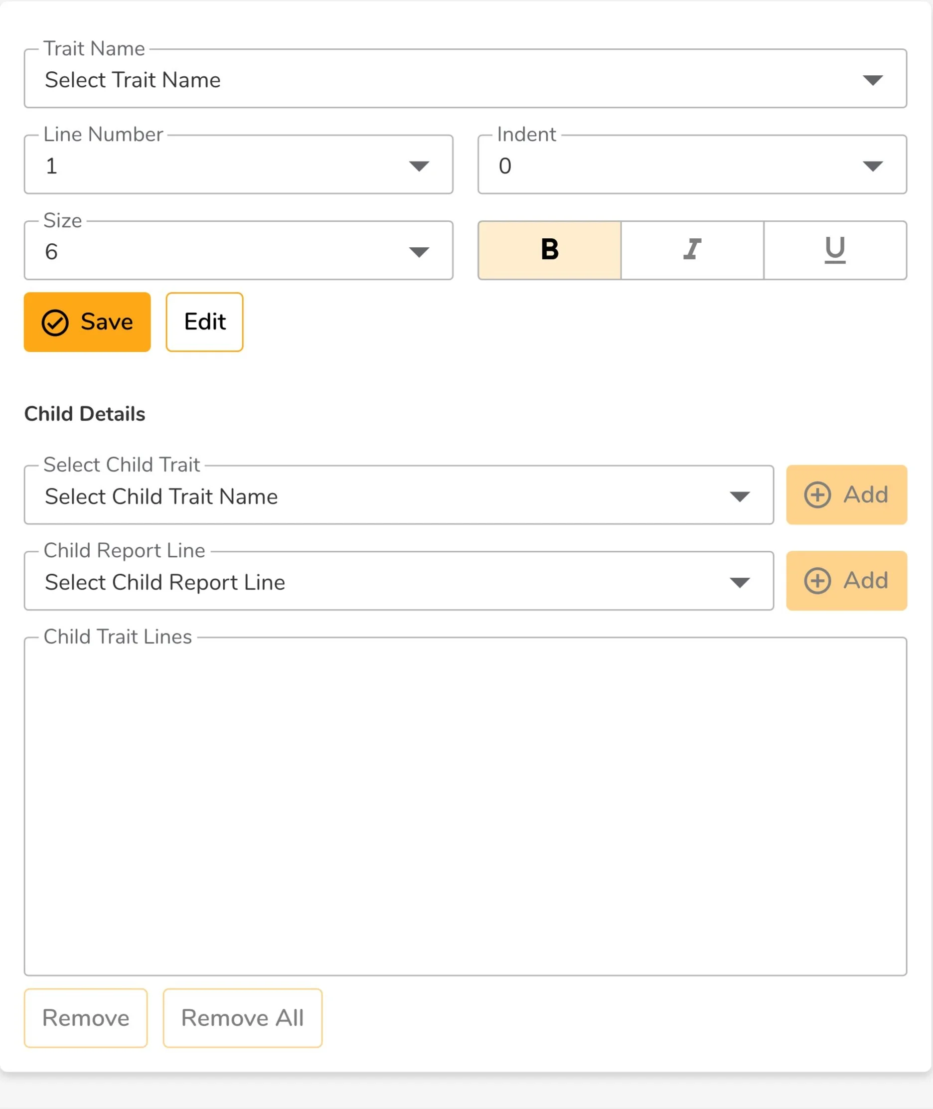
Updated UI.
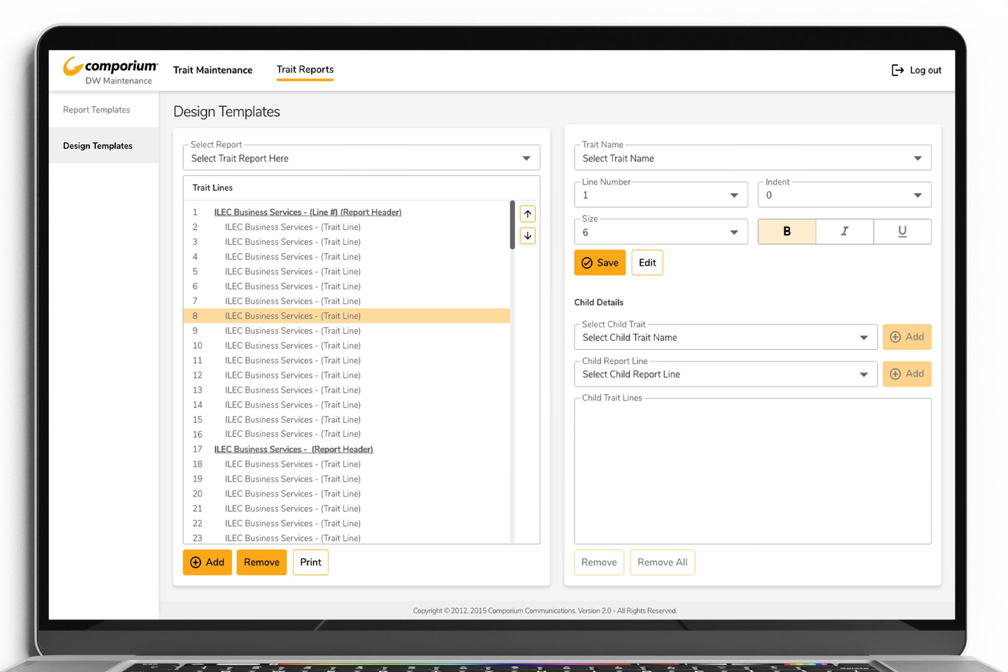
Visual Improvements
While the legacy application contained formatted reports, there was not a visual display of the formats selected. I advocated for an updated reporting format that displayed when lines within the report were bold, italic, underline, or contained different properties (Indent, font size, etc.) This visually improved the application by allowing users to see the result of their inputs directly on the report.
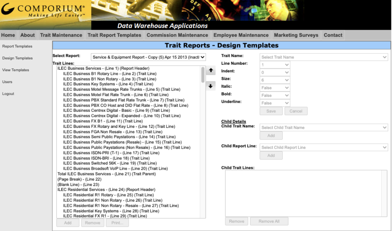
Legacy report template.
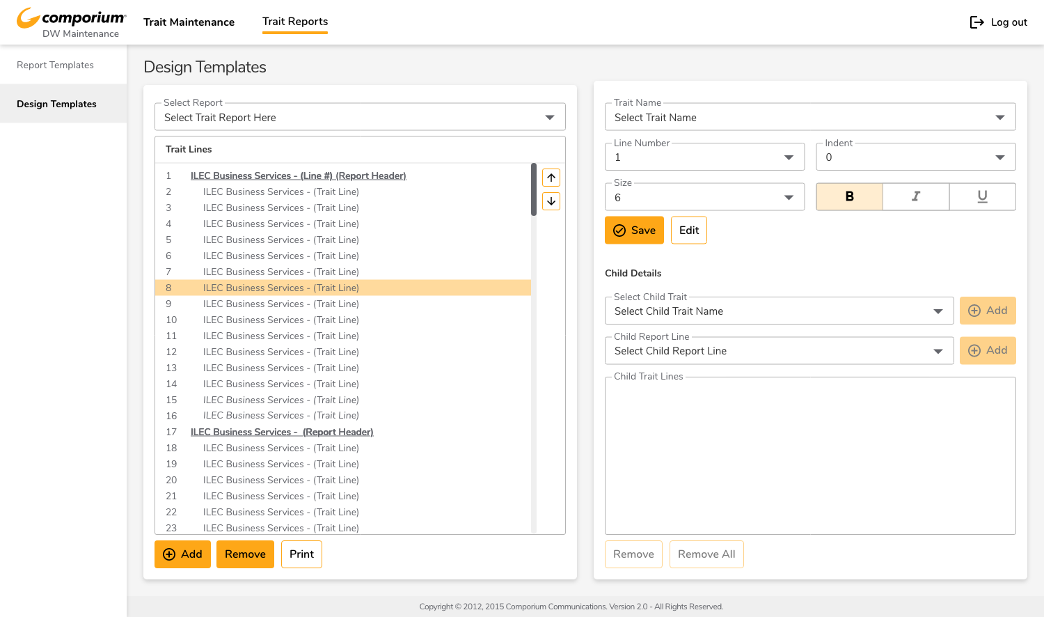
Updated report template.
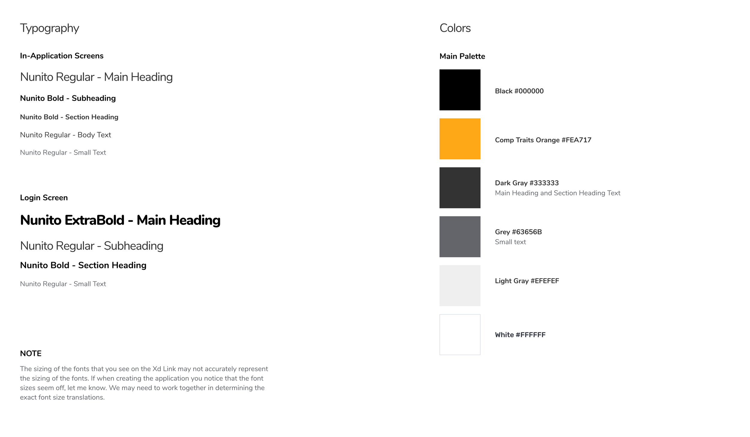
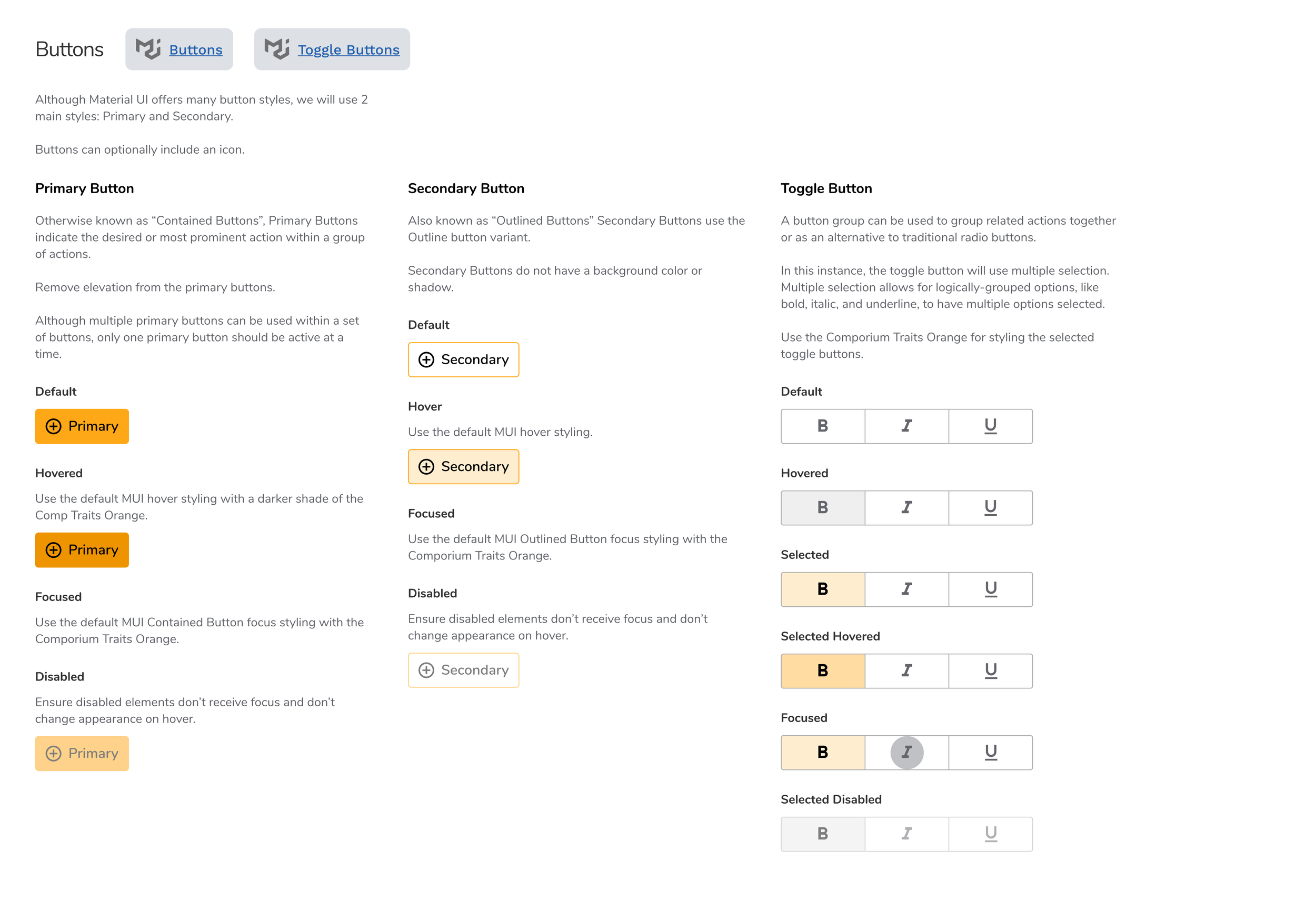
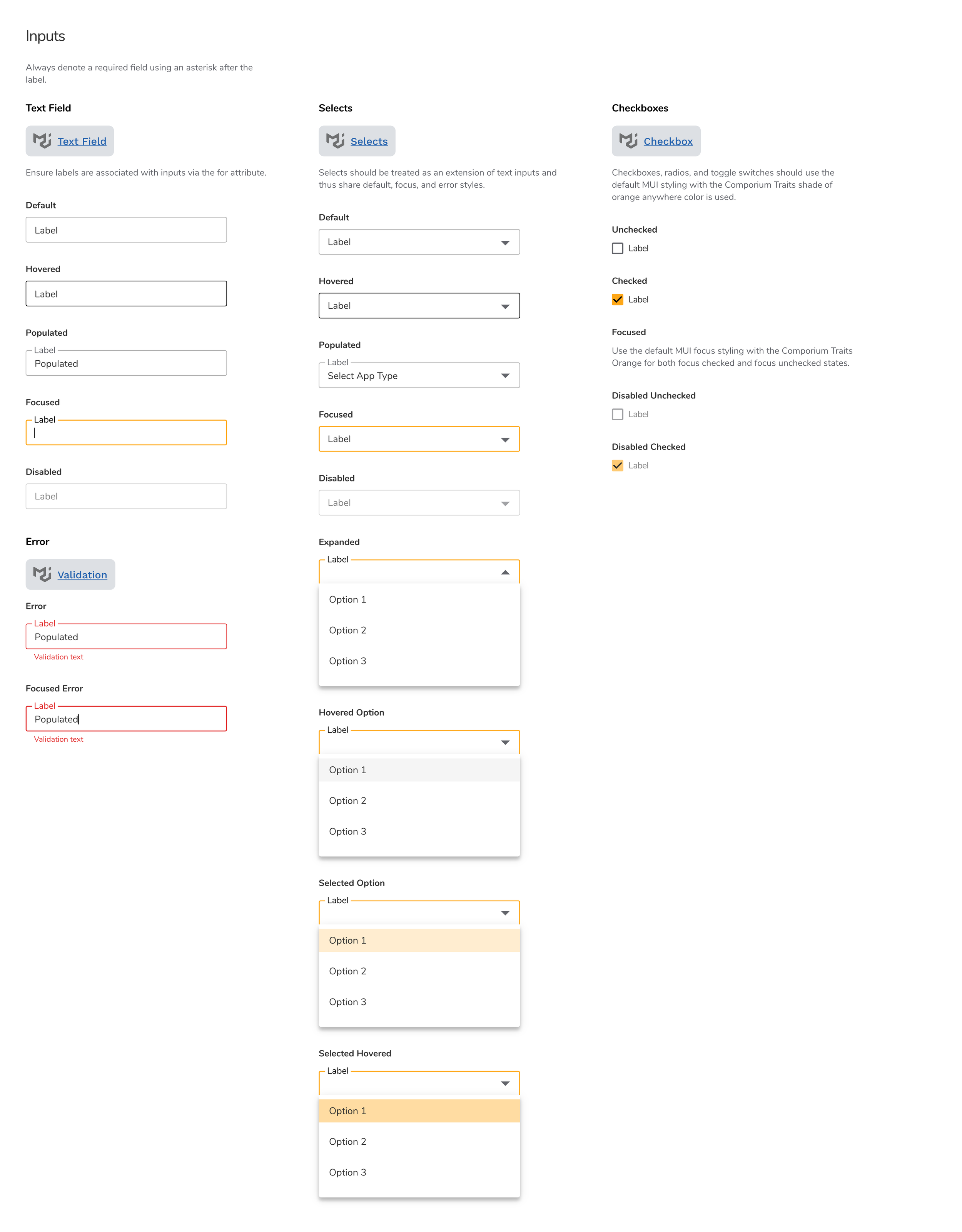
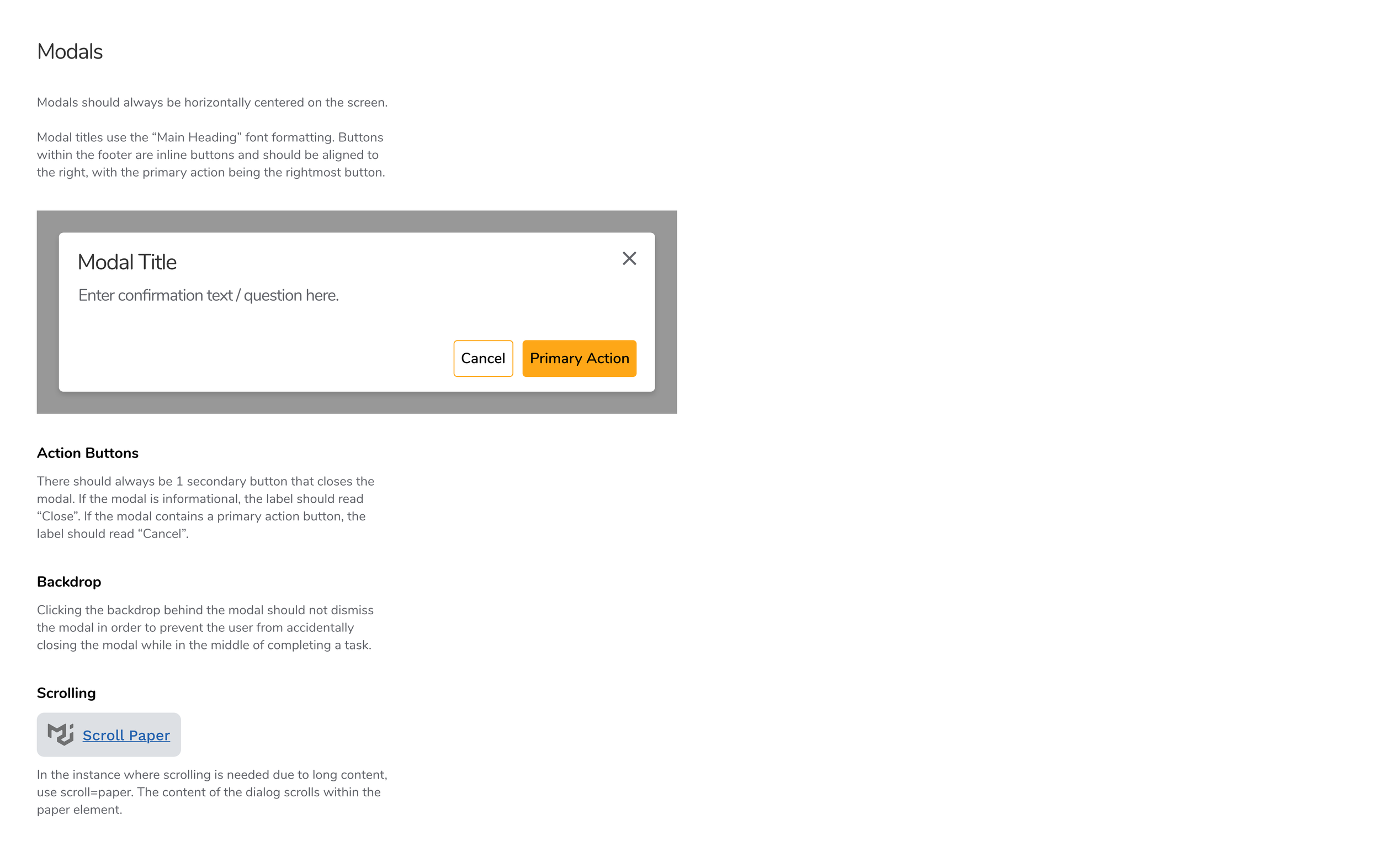
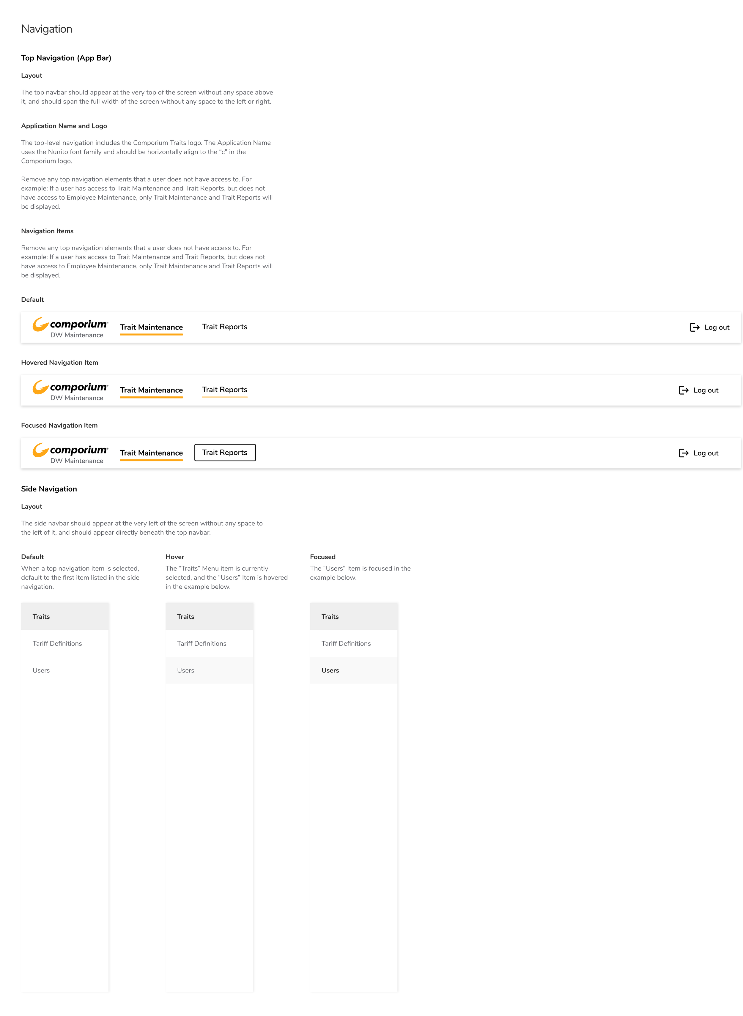
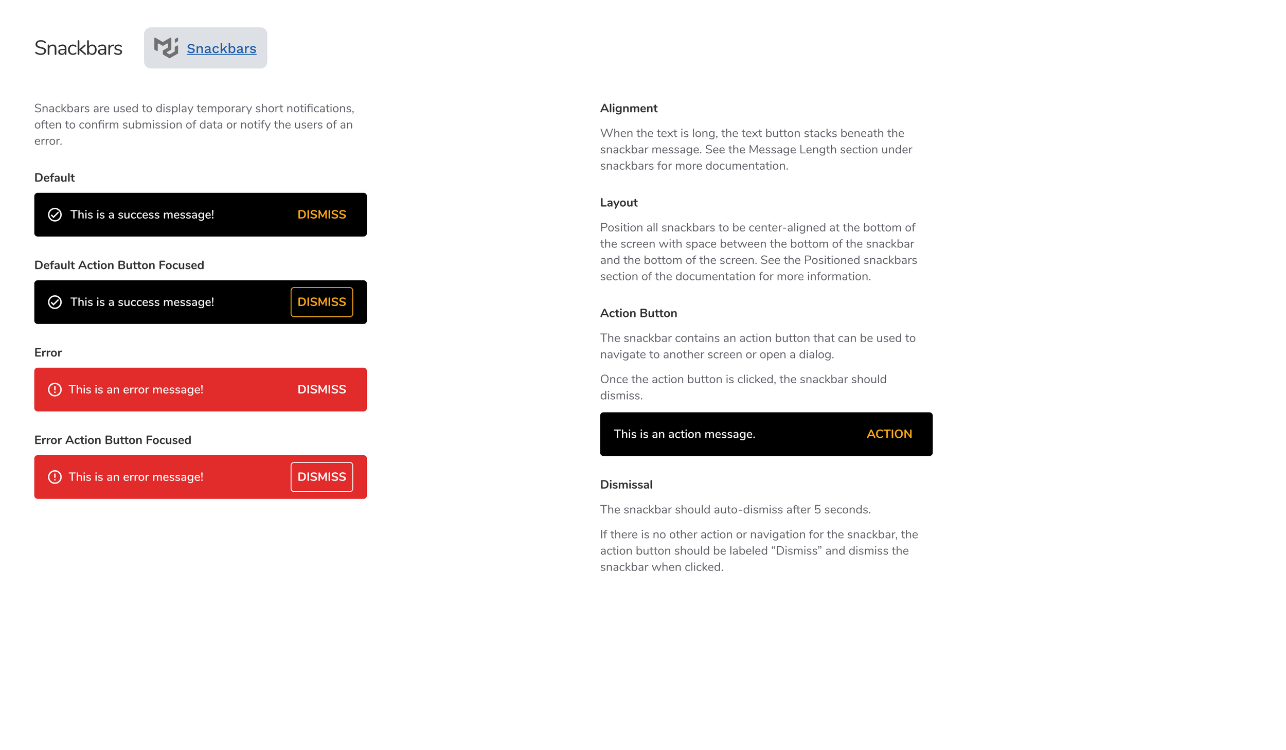
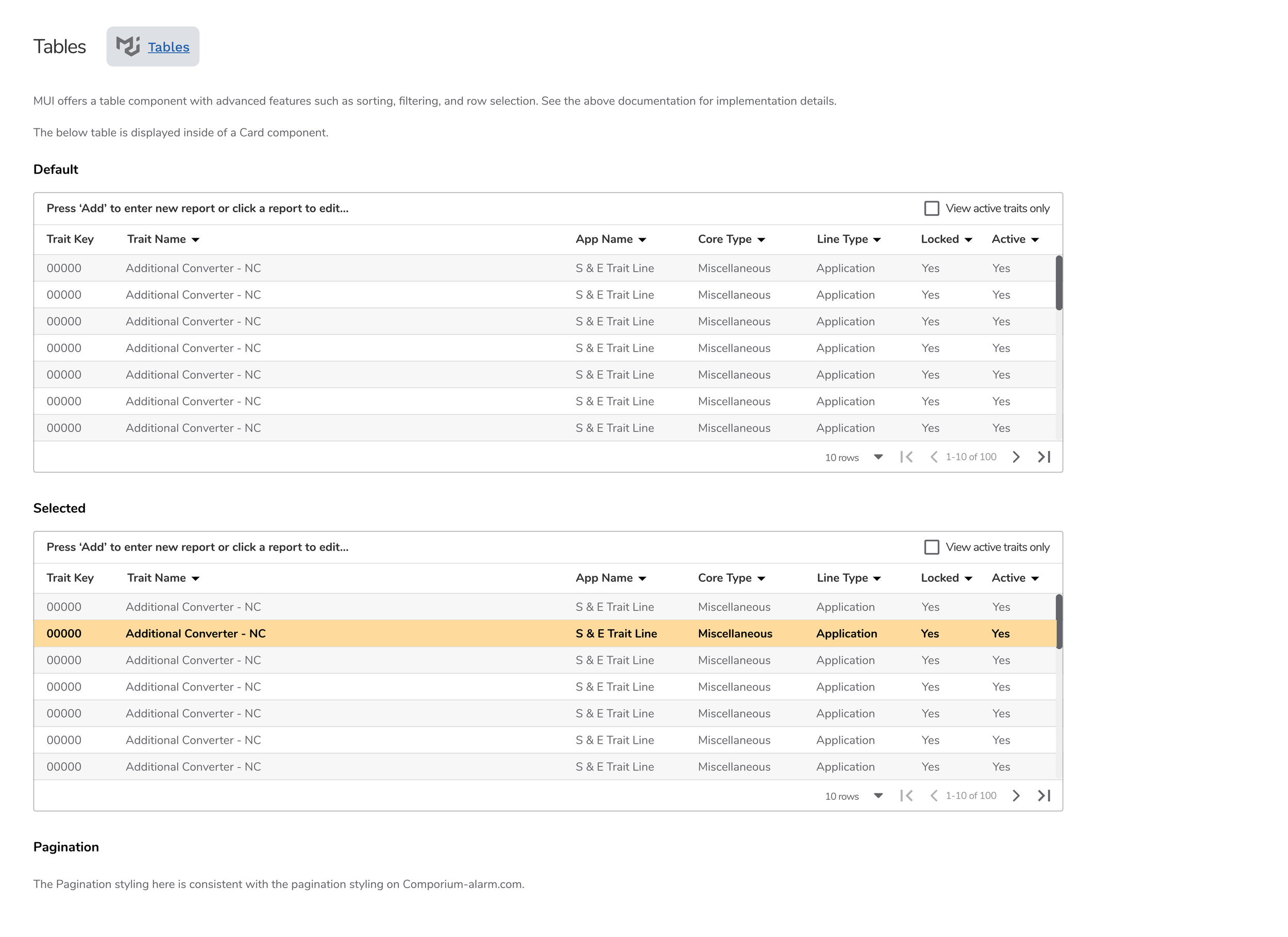
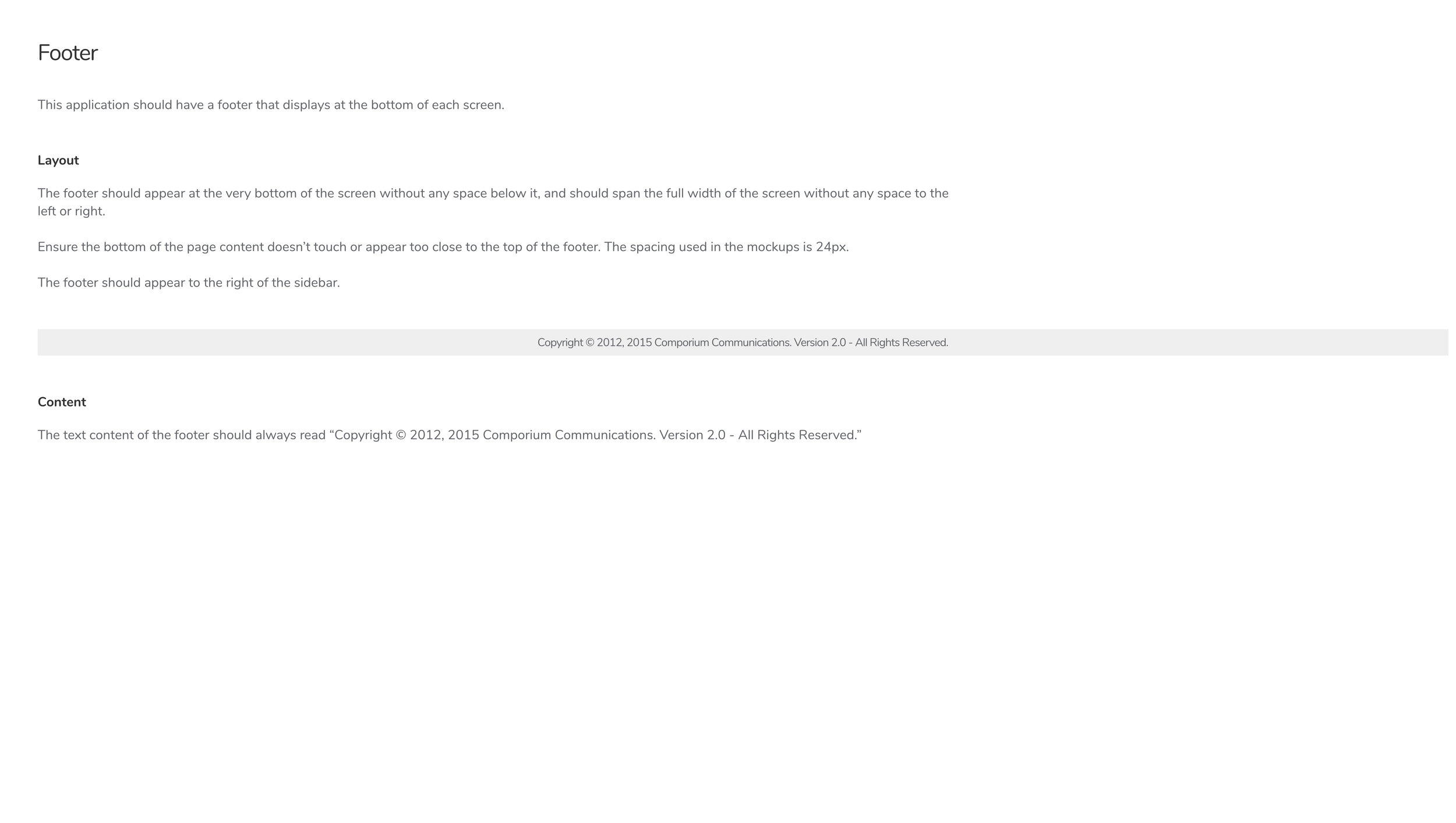
Style Guide
To ensure that all components and component states were defined I created the style guide shown below. Within each component section of the style guide I linked to the MUI React component library for developers to reference for further documentation.
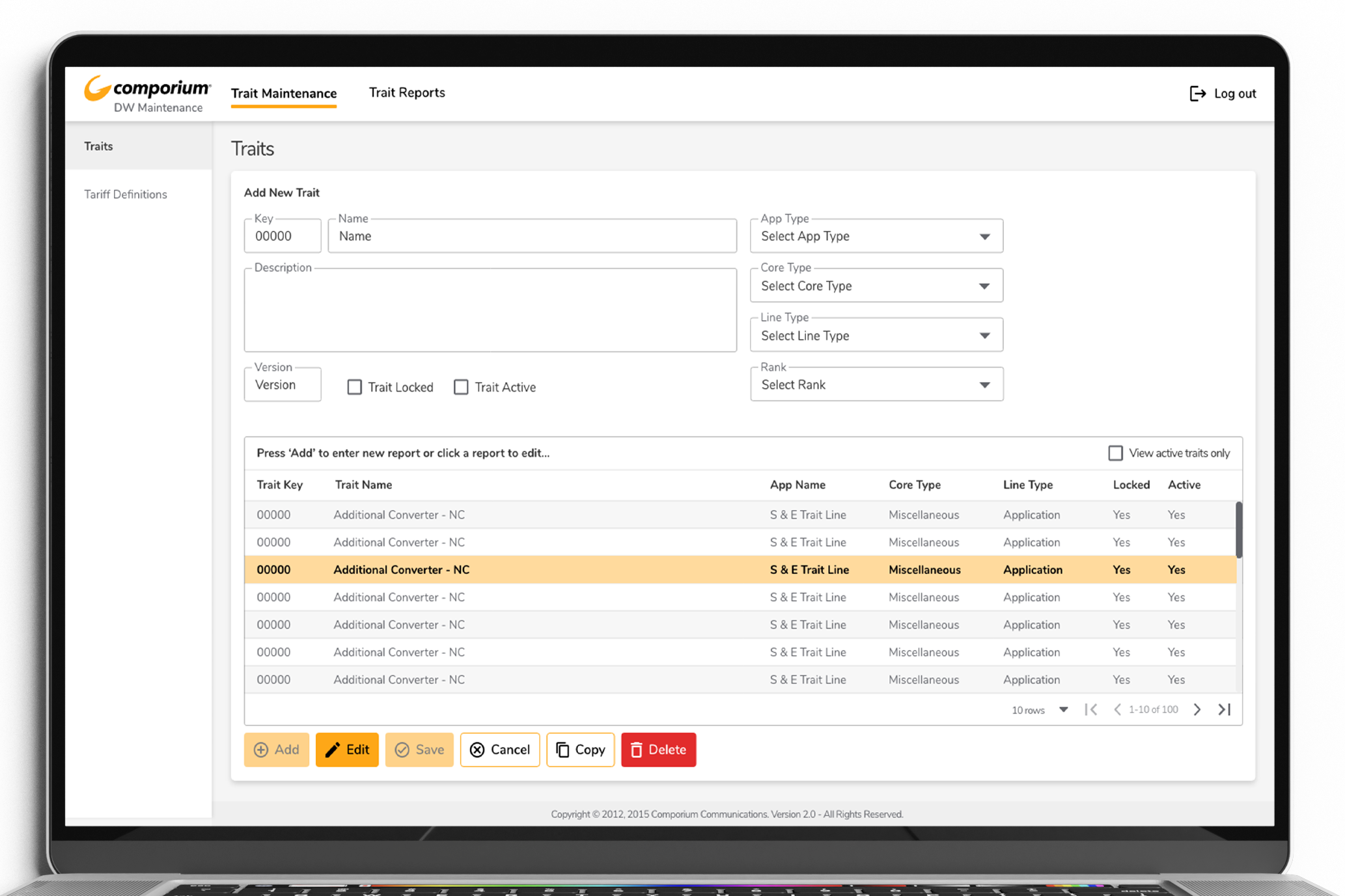
Mockups
Below are some additional mockups that I created for this project to guide development.
A Data Warehouse Application Redesign
Thank you.